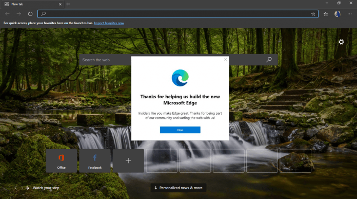
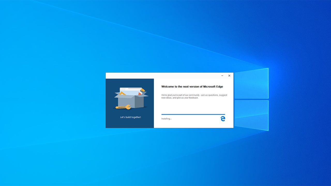
Furthermore, the new look of the redesigned logo solves a significant (if superficial) problem with the original Microsoft Edge. Namely, the old logo looked very close to Microsoft’s old Internet Explorer browser. With the new logo the company has addressed that issue. Microsoft unveiled the logo through a puzzle over the weekend. The company leveraged its Fluent Design Windows 10 aesthetic on the new logo. At the time it was widely believed the puzzles were leading to a full release of Microsofts Chromium Edge browser. In terms of the puzzle, Windows-fans were presented with pictograms, numerical codes, and hints that led to the new Microsoft Edge logo. For example, one of the puzzles showed a rendering of the Edge icon in OBJ model code.
As mentioned, the new Microsoft Edge icon design looks far lass like Internet Explorer and now has a wave like design.
Chromium Edge
A stable release of the Chromium-based Microsoft Edge browser seems increasingly imminent. Last month a stable development channel arrived on Google Search results. Chromium Edge is currently only available in preview. Testers can choose between three development branches:
Canary Channel: updated daily and considered the most unstable Dev Channel: Updated roughly on a weekly schedule and boasts more stable features Beta Channel: the third channel to launch is update more sporadically (around every 6 weeks) and is close to the finalized vision of Chromium Edge
A new Edge logo would certainly point to Microsoft preparing a full launch. We guess Ignite this week would be a good place to reveal the full Chromium Edge experience.


