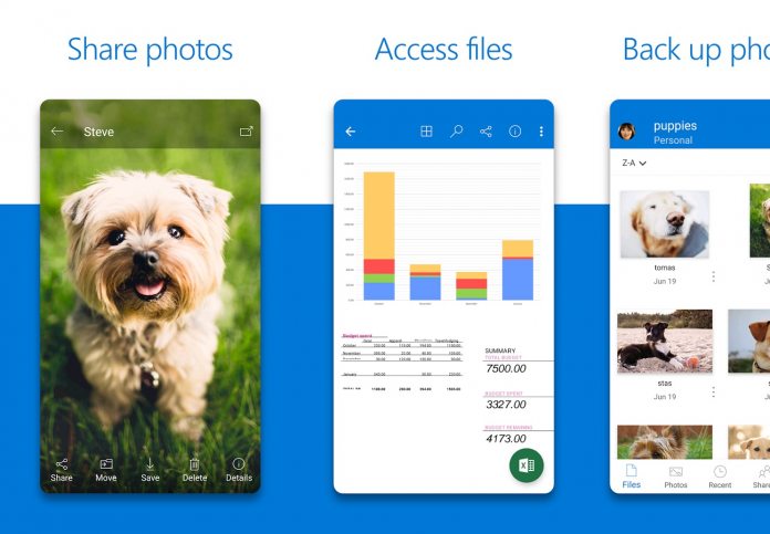
If you use Microsoft’s OneDrive cloud storage application on Android, you will be seeing an update today. The company has rolled out Version 5.1 of the app to users of Google’s platform. This is an important release because it delivers a new UI experience to OneDrive. While this is not a radical overhaul, you will certainly see the difference in aesthetic. The app is now more streamlined and efficient. Microsoft has mostly achieved this with a new tab bar, which makes using OneDrive simpler. The company says it is now easier to access Shared, Sites, and Recent content thanks to the tab bar. Microsoft has also introduced a new Me view. This part of OneDrive allows users to see notifications, Offline content and Account information in a single place. Here is the full changelog detailing the additions;
A brand new look and feel! We’ve updated the look of the app to help you be more productive Get access to your Shared, Recent, and Sites content faster than ever with our new tab bar navigation Check up on Notifications, your Offline content and Account info in the all new Me view
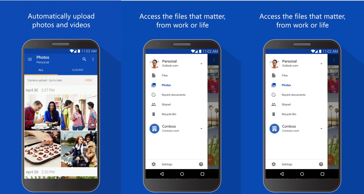
The image above shows OneDrive as it used to look, while the main image of this article shows the new experience. Microsoft has clearly gone for a lighter and softer approach. In fact, the app now seems more social media-like and consumer friendly. The previous design was more business-oriented. Let us know in the comments below what you think of this new design. You can download OneDrive on Android or update the app from the Google Play Store.
Boosting OneDrive
Back in August, Microsoft boosted the usefulness of OneDrive by introducing Office Lens integration. Office Lens gives users tools to trim, enhance and make images of whiteboards and docs. The service then saves the content into Microsoft’s OneNote app. Images can be converted to PDF, PowerPoint, and Word files. Microsoft has also introduced Files on Demand to the cloud storage service this year.


